This post was originally written for our internal technology newsletter at Work & Co. It is a little bit adapted for web, but the content is almost identical.
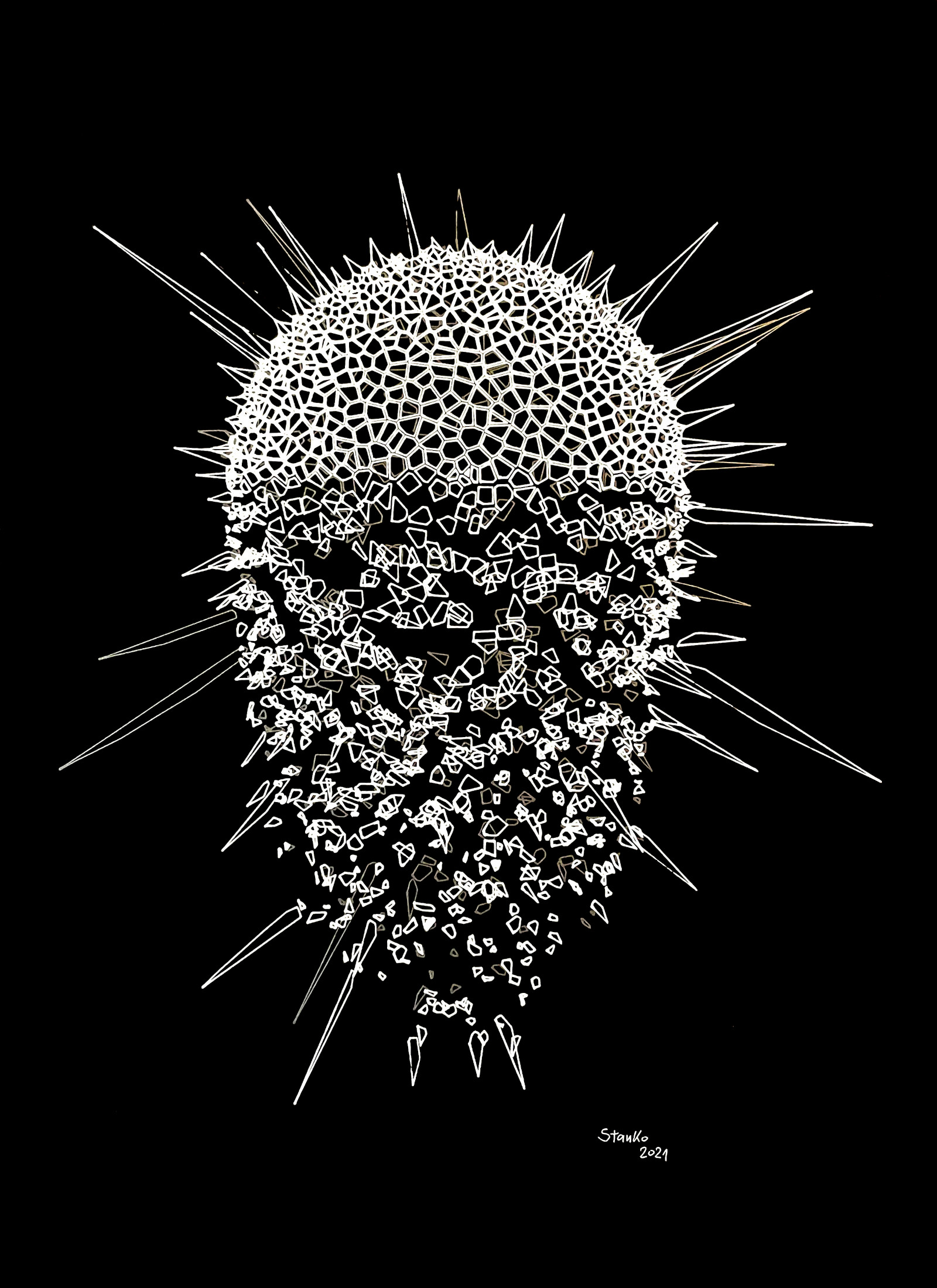
About a year ago I made this plot. It is called "Krypton"Named by a dear friend and ex-colleague, and I'll try to break down how it was made.
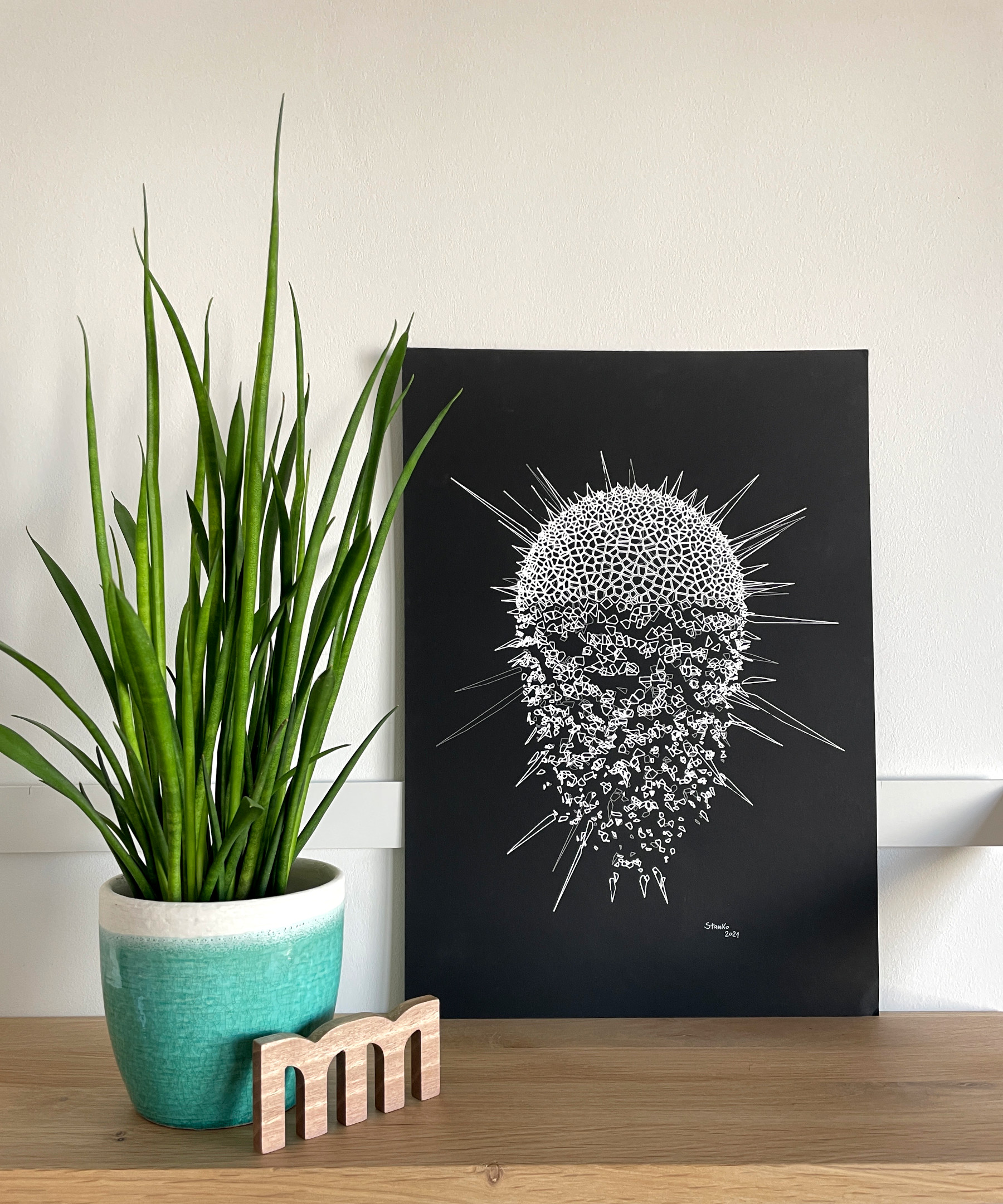
The wonderful thing about generative art is that code is just a tool. Thing that really matters is the actual artwork. In this specific case, code is straightforward and relatively simple. But it produces drawings that, in my opinion, look visually pleasing and have a nice sense of depth to them.
Tooling #
For all of my generative work, I use plain JavaScript, p5.js and a couple of custom-made tools. These tools are often crude, but they do exactly what I want so I don't mind. With each new project I keep adding more features and polishing them. At some point these tools may reach the point where they are presentable. If that happens I'll gladly share them with the world and open source everything.
This is how the interface looks. I have an easy way to add controls for image parameters. These controls allow me to tweak drawings with a short feedback loop. Each time a parameter is changed, the image is redrawn and the parameter is reflected in the URL. This allows me to go through iterations using the browser history.
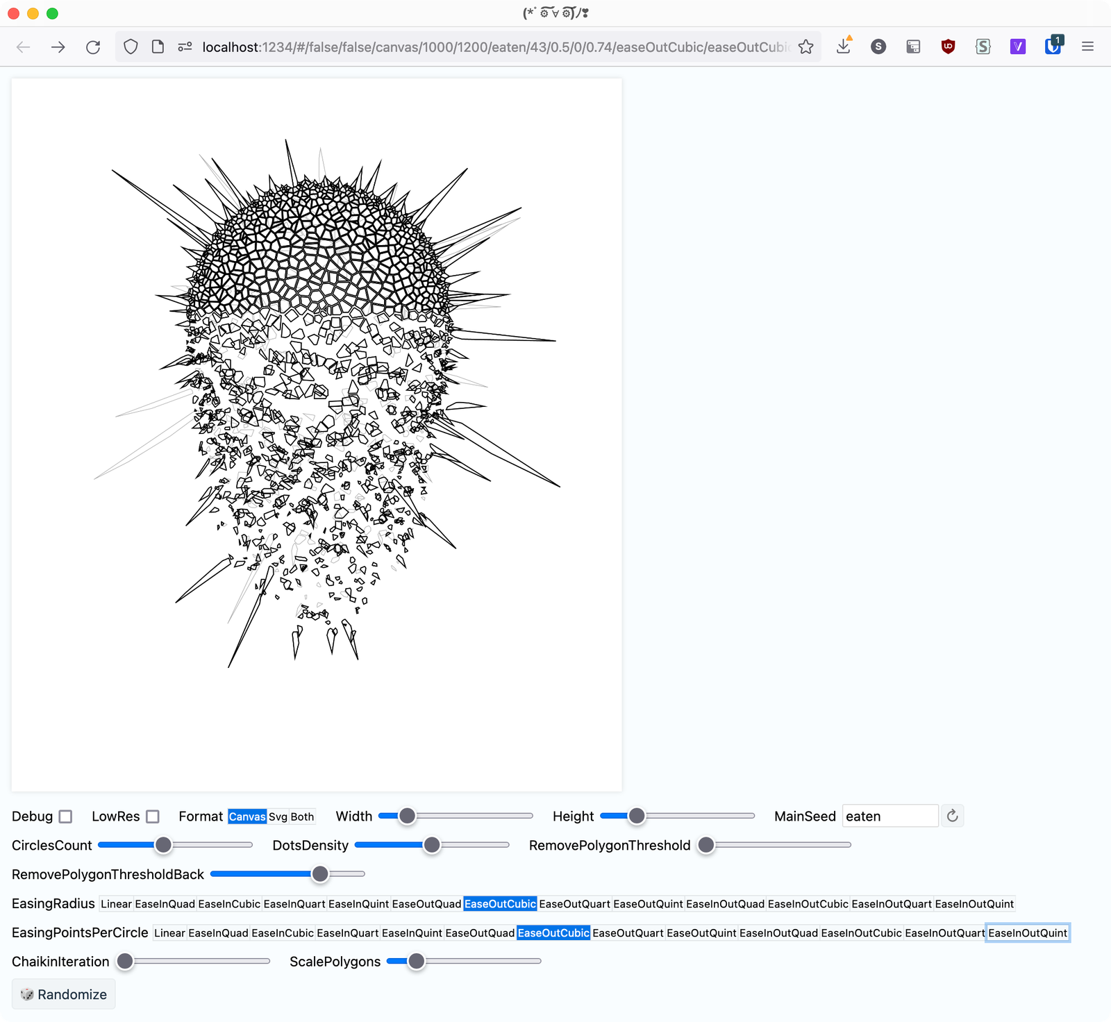
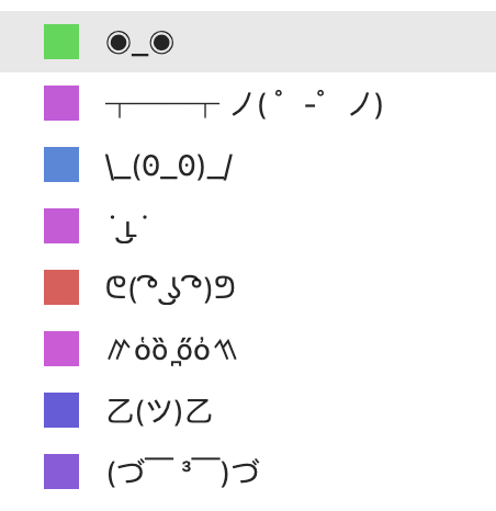
To make navigation through the history easier, for each unique combination of parameters, I generate a random color and ASCII face. That is why my browser history looks like this :)
Voronoi diagram #
I use Voronoi diagrams a lot in my drawings. So much, that I'm sometimes trying to avoid them, to make sure I'm not limiting myself to a single algorithm.
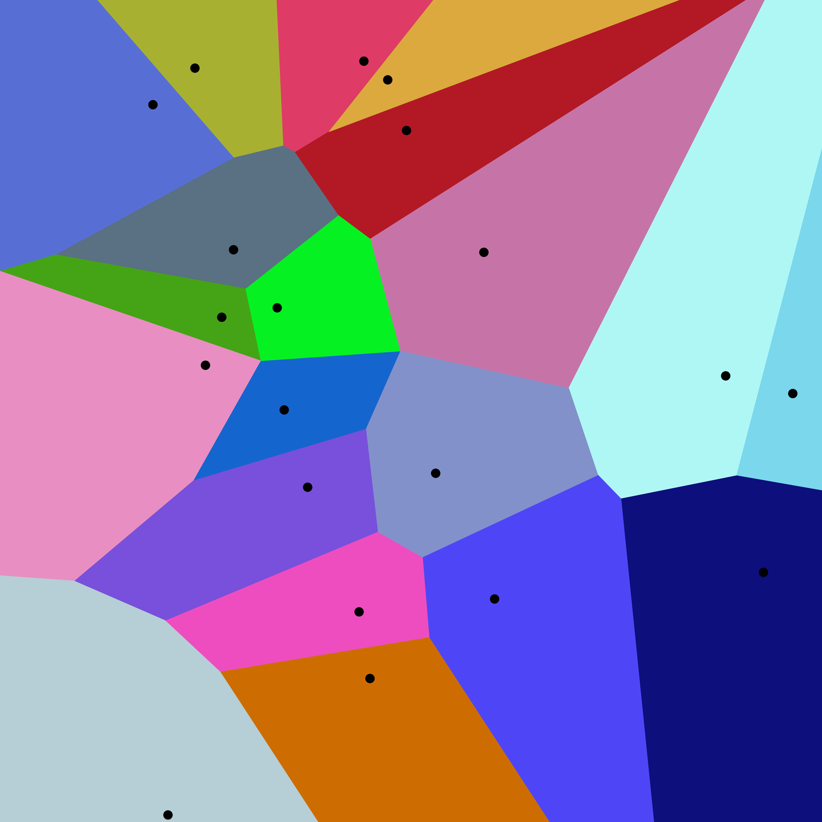
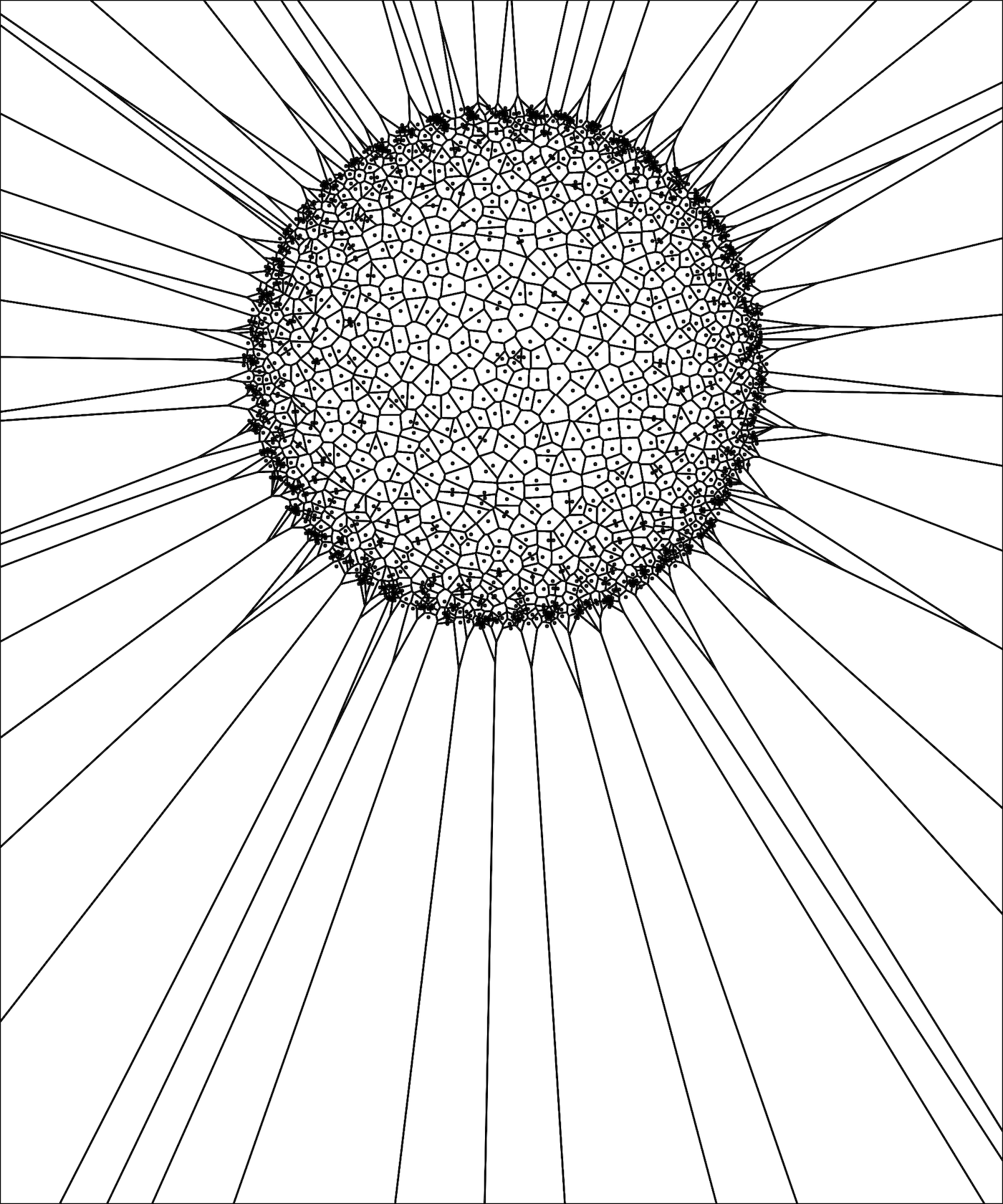
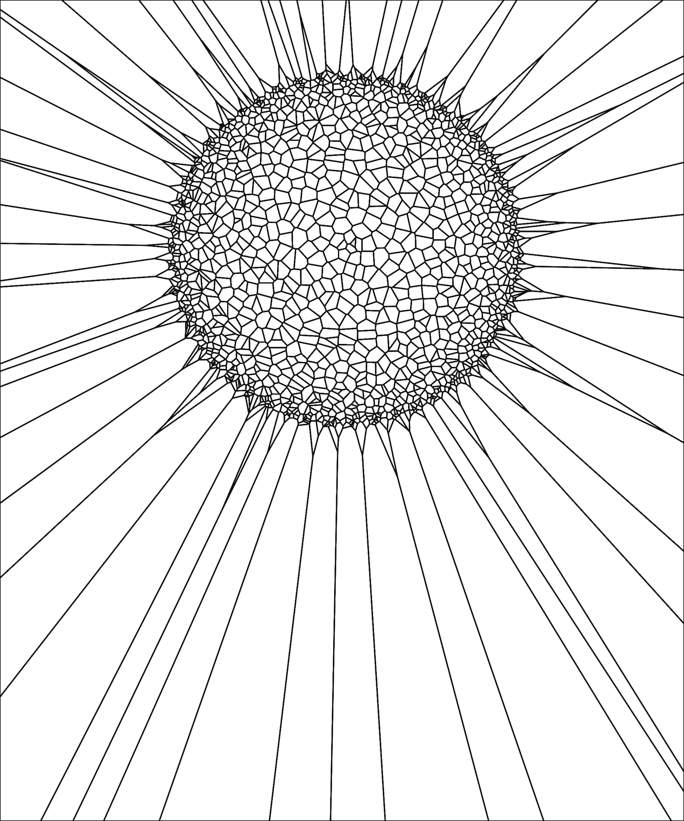
Voronoi diagram takes a collection of points, and then partitions a plane into polygons, where each polygon's edge is right in the middle of two points. It sounds like a lot, but if you study this image, it should become clearer. For a more detailed explanation you can check out the article on Wikipedia.
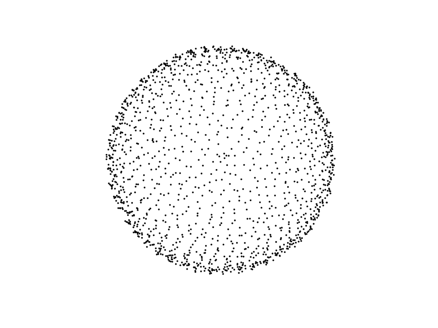
Generating points #
To get Voronoi polygons, we'll need some points. We'll iterate from the center, and in each iteration, we'll take a random point on a circle and displace it a little bit, so it doesn't look artificial. Then, increase the radius and repeat the whole process. The larger the radius, the more points we are going to generate.
The result looks nice, but it took me a number of tries to get it just right.
Now when we have our points, Voronoi can do it's thing. This is what we end up with.
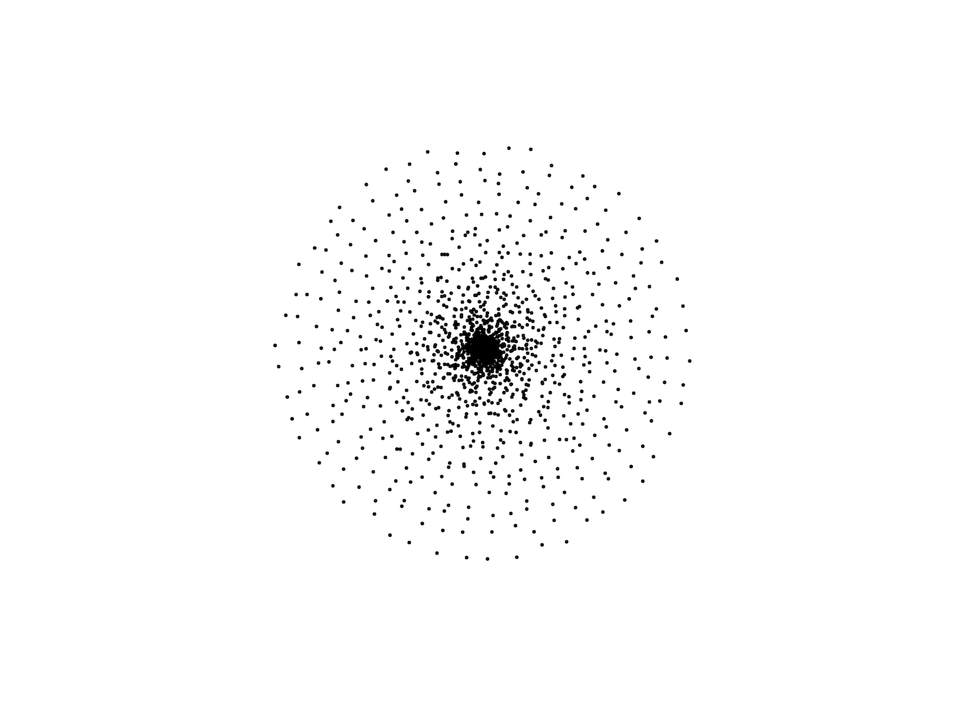
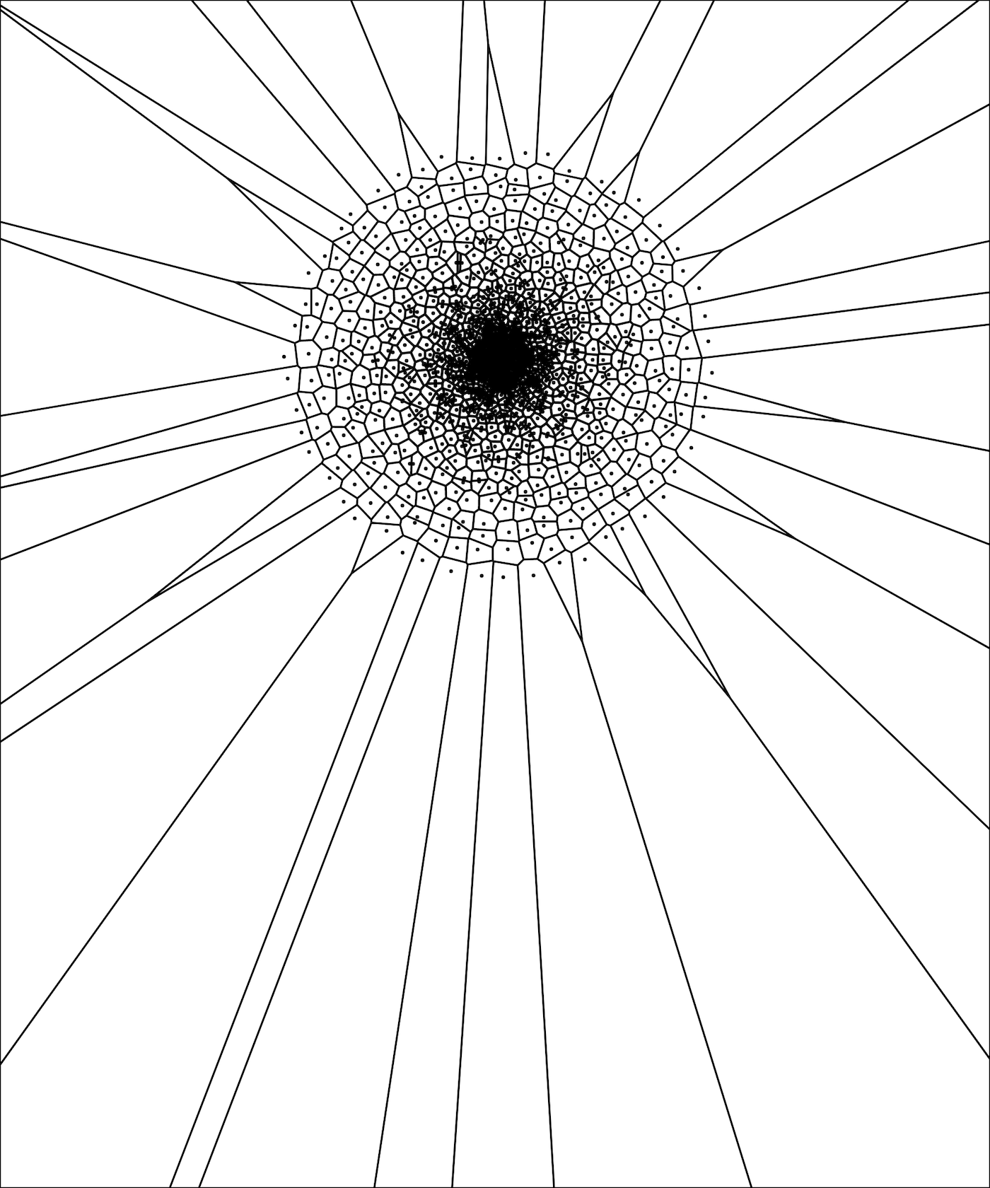
Different points distribution #
Like I mentioned, the point distribution is something I tweaked to get the result I like. For example, if we change the easing function for radius increasing ("ease in" instead of "ease out"), we'll get a completely different result. If you ask me, it doesn't look nearly as good.
Let me give you a tip, if you start doing generative art, don't be afraid to experiment. If a parameter looks nice in a range between 10 and 20, try -50 or 300 or swap x and y coordinates. Do it for fun, as a lot of times it will not look good, but sometimes it will and it will just blow your mind.
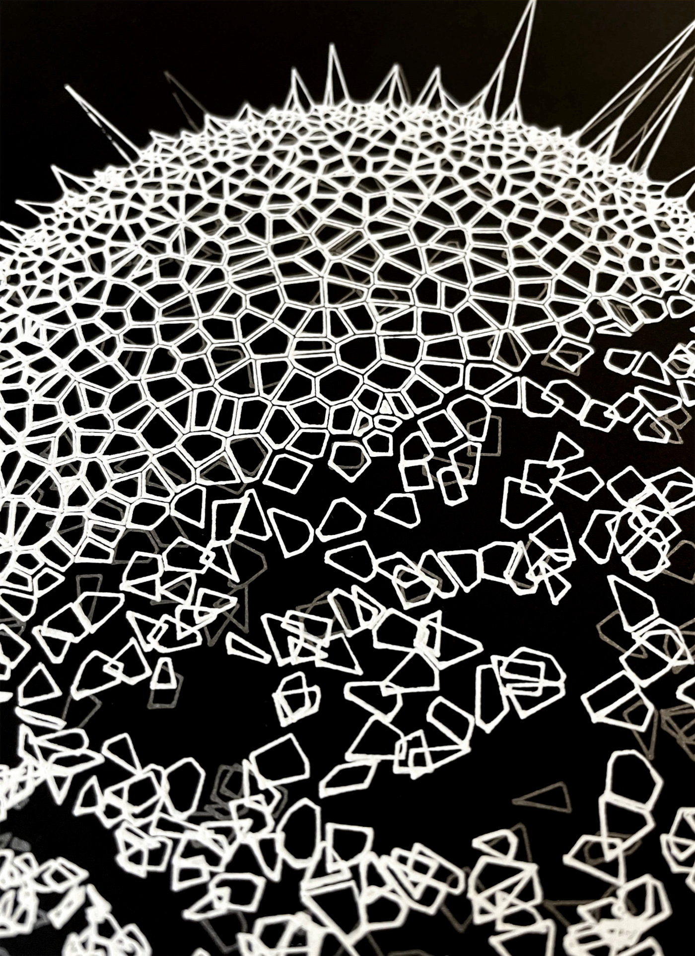
Cleaning up Voronoi #
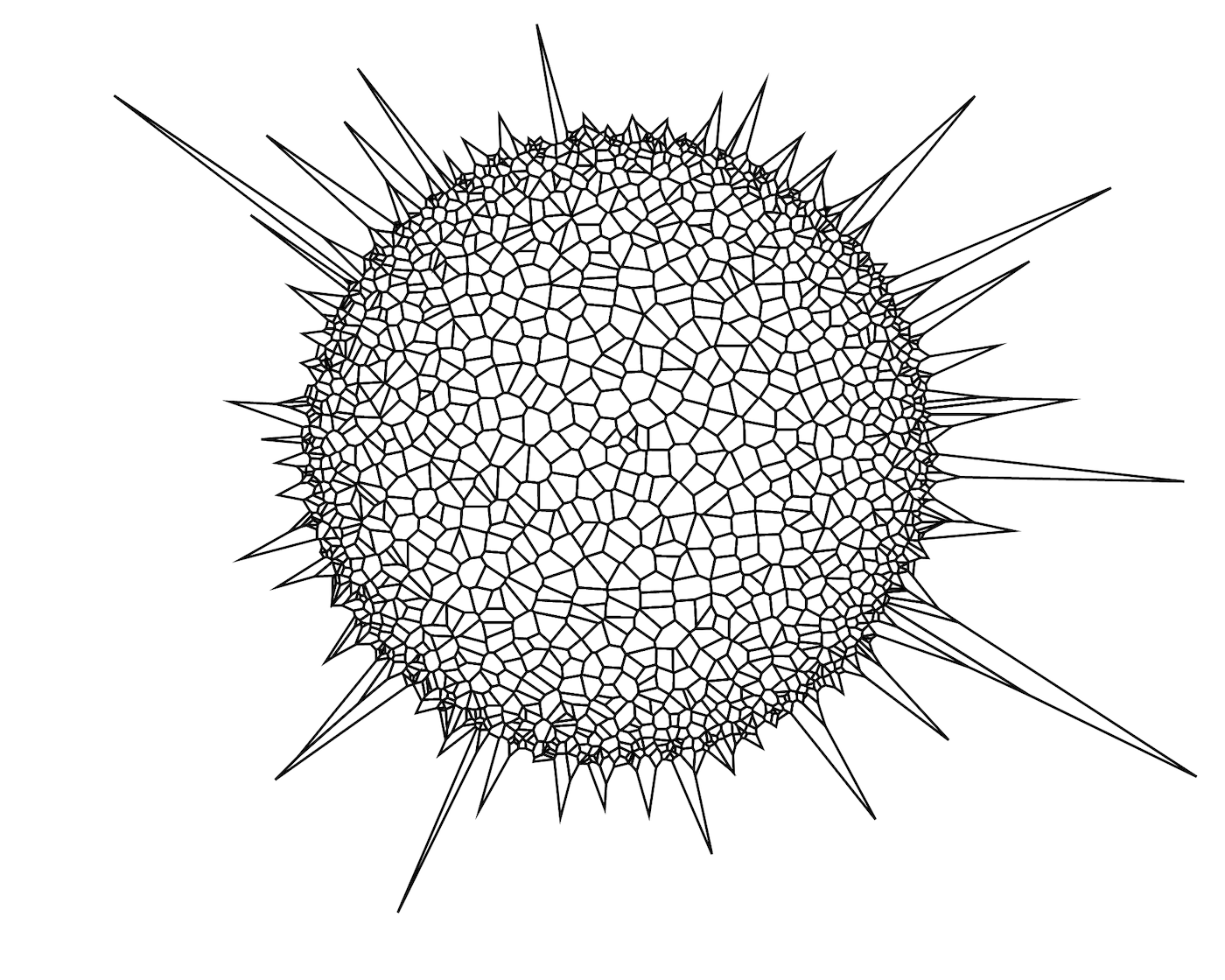
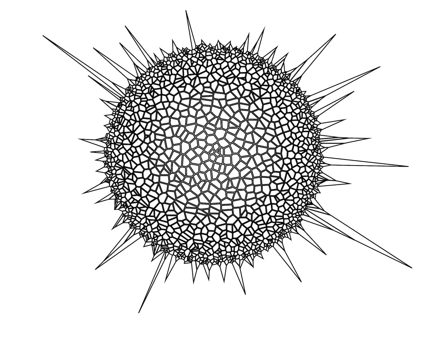
Let's get rid of points, as they already did their work. We can loose these weird looking edge polygons as well. When I got to this point I thought to myself: "OK, this is taking shape. I can work with this."
Back then, I experimented a little bit with colors.
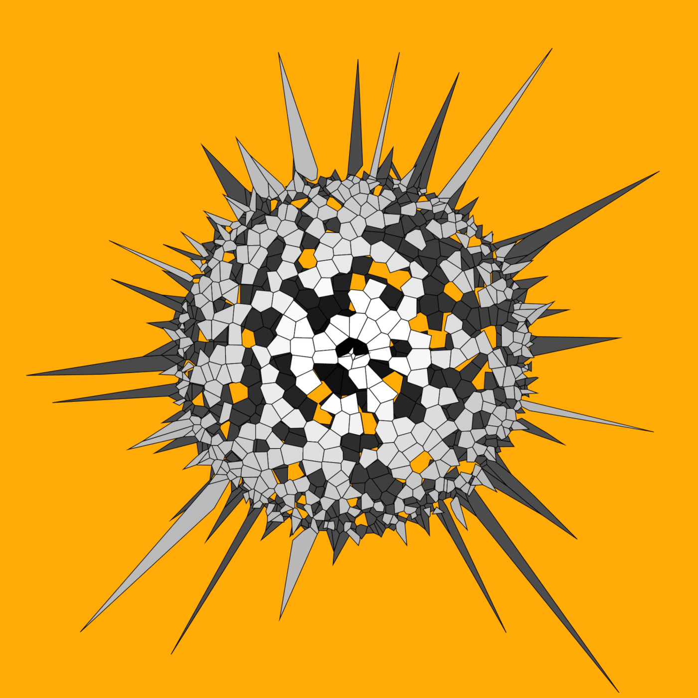
But as I wanted to pen plot the drawing, I abandoned the whole full color idea.
Making it interesting #
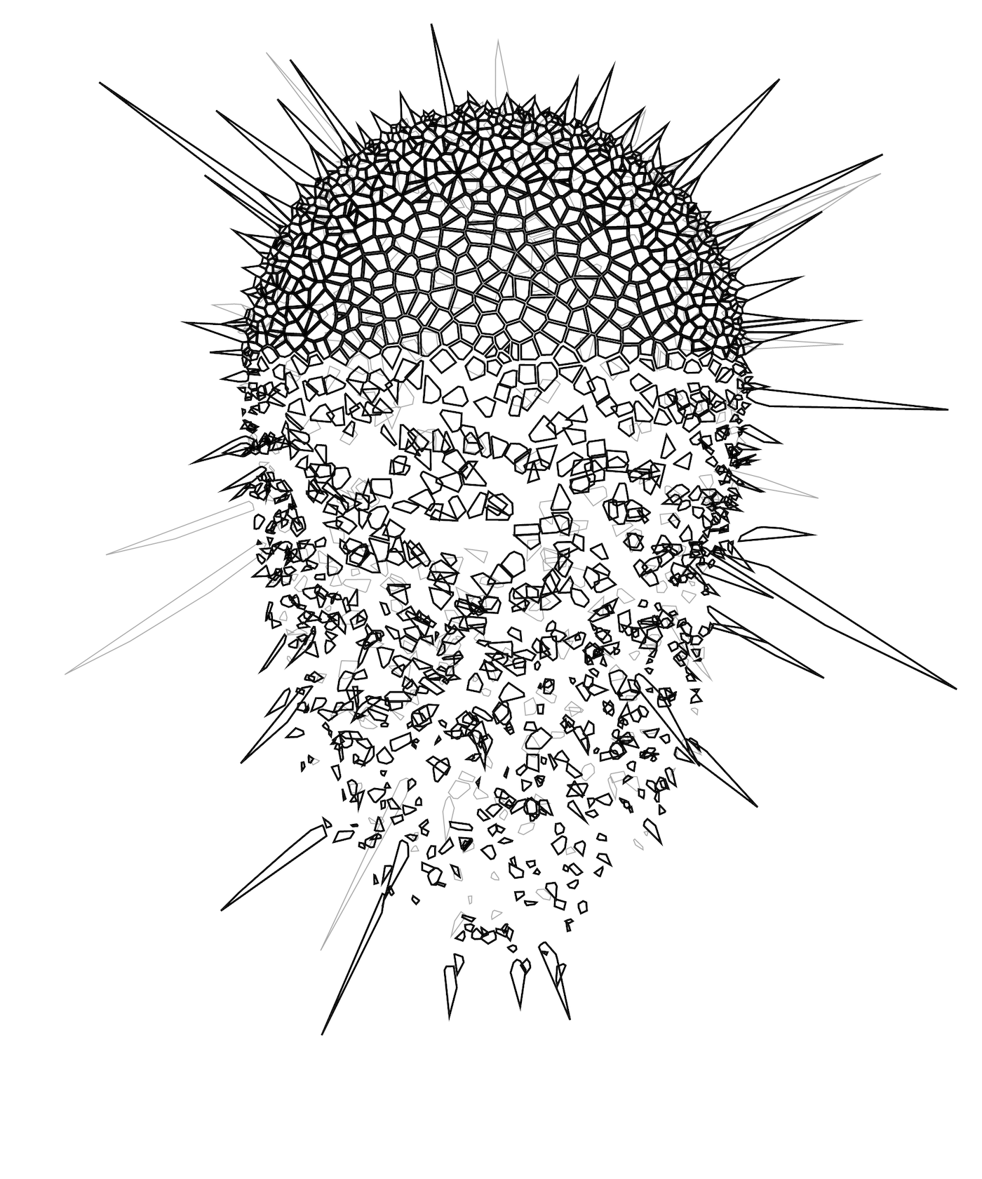
We made a solid base, but let's try to make it more interesting. How about we space the tiles apart a little? Randomly remove pieces? Make the whole thing explode? Or maybe pieces could start falling apart? Tiles could have rounded corners? The general idea is to mimic phenomena from the physical world by using a little bit of carefully introduced randomness.
I tried all of the things mentioned above, and for the final plot I scaled the tiles and made pieces break off the main structure. Only pieces in the lower half are offset. The further away they are from the center, the more offset they are going to be. A little bit of randomness is sprinkled on top to break the mathematical orderliness.
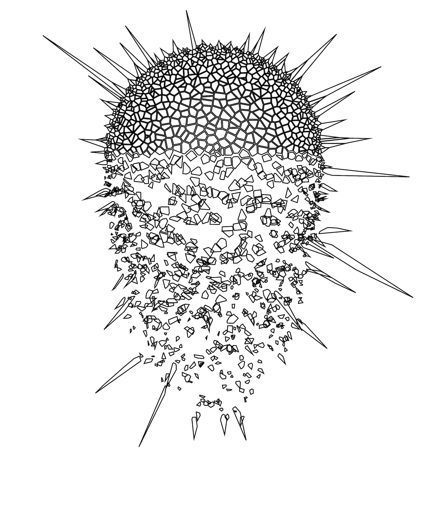
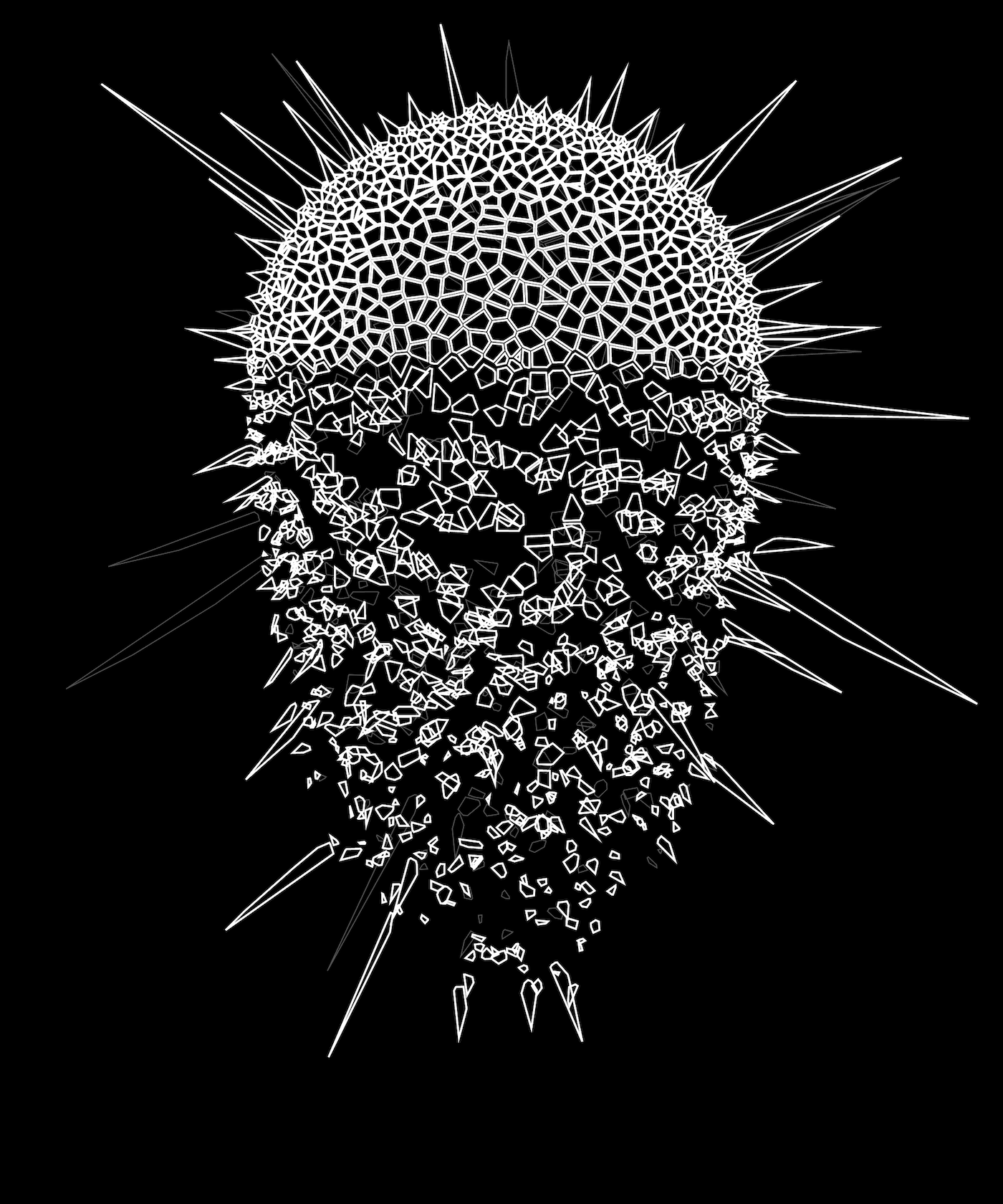
Then I added another layer to give it more depth, and finally inverted the whole image, as I was planning to plot it on a black paper.
Plot #
I plotted the drawing on Fabriano's Black Black paper, using Sakura gel markers. Between the layers, I had to swap the markers and run it again. For this particular drawing, it wasn't that important if the layers are not perfectly aligned. But in some cases it can be really tricky to swap pens precisely.
Fun fact, the drawing was reserved and sold even before it was plotted. It went to US, to now an ex-Work&Co colleague.
Conclusion #
Basically, it takes only a few steps to generate Krypton. I hope this will inspire you to try fooling around with creative coding.
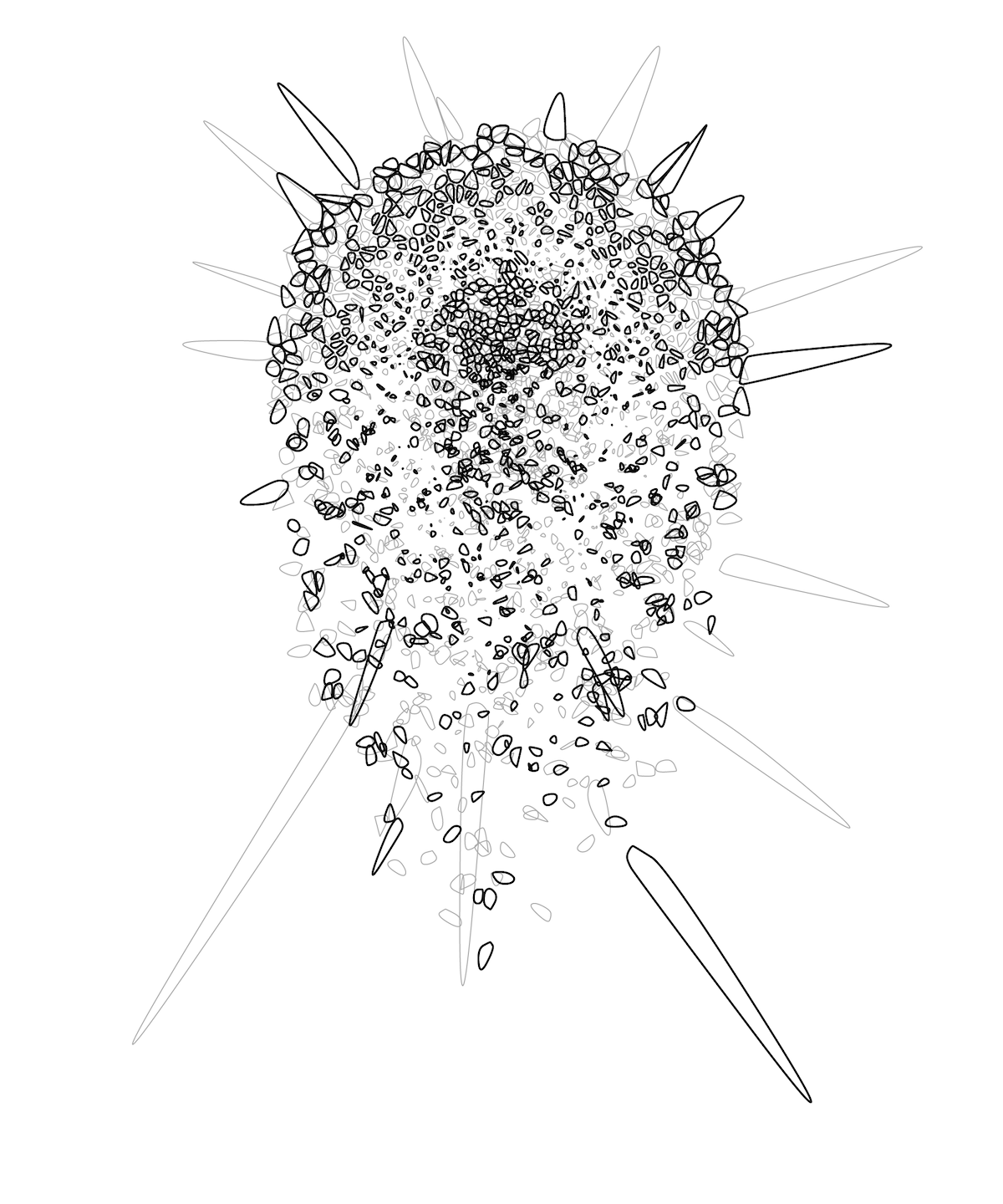
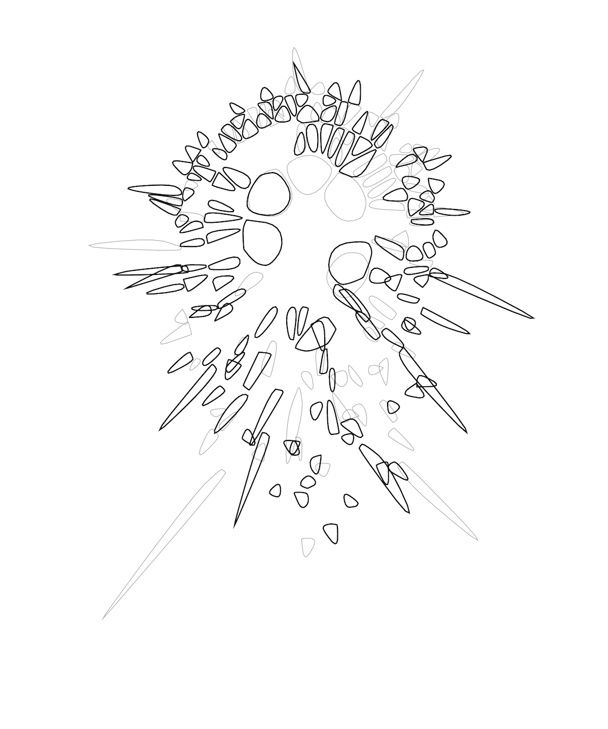
To encourage you, here are a few rejected examples of generated images. These are not nearly as nice. Randomness is a super powerful tool, but you need to play around with the values and finely tune them to get good results.
You can find this and my other plots on my Instagram profile. At some point I'll stop being lazy, and make an artwork section here on my website. I did it!